Our brand reflects who we are as a university. From the vibrant colours to our signature design flourishes, how we speak, think, look, and behave is unified and cohesive.
When we say CapU offers a remarkable space to thrive, we back it up with a welcoming, passionate, nurturing, curious, and innovative place—a distinct university experience inspired by imagination.
Our purpose is to cultivate life-enhancing learning experiences. We achieve this by staying close to our foundation, always being open, expressive, dedicated, relevant and enterprising.

Brand Guidelines
The colours, patterns and elements work together to create a distinct brand identity that is entirely and unmistakably CapU. Download our guide to learn how we got here and how to use the brand.
Download Brand Guidelines (PDF)Our logo
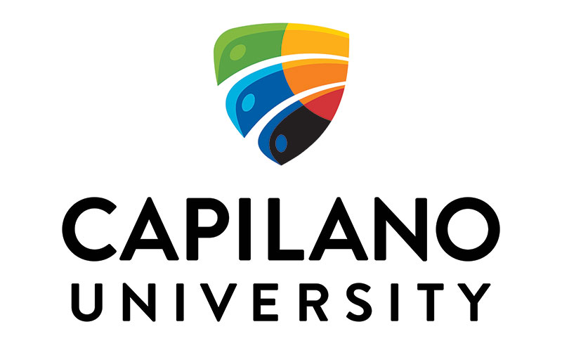
The colours are inspired by the traditional Coast Salish palette, with deep navy blue representing the darkness that precedes knowledge and red reflecting the colour of illumination. Multiple shades of blue recognize past symbols from the University’s history.
Together, these colours strengthen the symbol as a signal of pride in identity, both individual and collective, that honours the rich diversity of the campus community

The shape and feathers
The mark's shape is emblematic of an eagle’s wing, in three feathers.
The white lines represent two pathways of peaceful coexistence, acknowledging all members of the campus community. The arc and angle suggest that someday, the two will meet, creating a promise of reconciliation and acknowledgment of the social context of our times.
The arcs disrupt the traditional crest shape while the overall form remains whole and united. This progressive disruption is further accented by the rounding of the upper left corner of the mark — the wingtip of an eagle.

Visual elements of the CapU Brand
Our colours
The CapU colour palette is: Sky Blue, Navy Blue, Mid Blue, Light Blue, Cream, Warm White, Yellow, Orange, Pink and Rich Black.
Our palette has an emphasis on blue tones and this is reflected in our use of colour. The combination of tones also matches our commitment to accessibility and legibility for people with visual impairments.

Our shapes
Inspired by the five elements of our brand personality: open, relevant, enterprising, expressive and dedicated.
Our nine shapes are flexible visual icons that can be used across all contexts and materials.

Our patterns
Inspired by our physical environment, patterns are an expressive element of our brand identity.
They augment content or materials that need a hero graphic or decorative background to pair with lighter content.

Questions about the CapU Brand? Get in touch!
MDX is here to help
Our Marketing and Digital Experience team will help you bring the CapU brand to life.
They support everything from visuals to voice and are your go-to for questions about using the brand confidently.
CapU employees can visit us on Frontlines. Everyone else can reach us at marketing-digital@capilanou.ca.

